

A website that sells isn’t the prettiest one, or the one with the most animations. It’s the one that gets someone to arrive, understand in seconds what you do and write to you. I’m Irys, I design websites without an agency in between, and most of the redesigns I’m asked for start from the same complaint: “I get visits, but nobody contacts me.” Nine times out of ten the problem isn’t a lack of design, it’s too much noise and not enough clarity.
Here’s what, in my opinion, a website that sells needs to have, and what it can do without.
What a website that sells absolutely needs
1. A clear message on the first screen
Someone arriving at your site doesn’t know you and won’t read a long paragraph. In the first thing they see, they should be able to answer three questions: what you do, who you do it for and what they should do next. If they have to scroll or guess to work it out, you’ve already lost part of your visitors.
A good headline says what you offer in ordinary words. “Comprehensive solutions for your business growth” says nothing; “Web design to bring you more clients” does.
2. One visible call to action
Every page should have one main goal: ask for a quote, book a call, send a message. That button needs to be easy to see, repeated at logical points on the page and say something specific. “Request a quote” works better than “Submit” or “Find out more”.
If you give visitors five different paths, they usually won’t pick any of them.
3. Speed and good behaviour on mobile
A good share of your visitors will arrive on their phones. If the site is slow to load, the buttons are tiny or the text forces people to zoom in, they leave. Speed isn’t a technical detail: it’s part of the first impression. Well-optimised images, few unnecessary libraries and decent hosting solve a large part of the problem.
4. Real signs of trust
Before writing to you, people want to know there’s someone serious behind the site. Simple things help a lot: an “About me” page with a face and a name, real work they can look at, clear contact details and a legal notice in order. Be honest here: if you don’t have client reviews, don’t make them up. It’s better to show a clear way of working than to fake a reputation.
5. A structure that makes sense at a glance
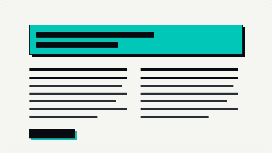
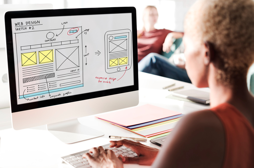
A short menu, pages with a defined purpose and visual hierarchy: headings that stand out, short paragraphs, plenty of white space. Someone in a hurry should be able to read only the headings and still get the idea.
6. Copy written for the person reading it
Design without good copy is an empty wrapper. Write in the second person, talk about your client’s problems before your own story and avoid jargon. What your service does matters less than what changes for the person who hires it.
What almost every website has too much of
Sliders and automatic carousels
Hardly anyone waits for the third slide. They tend to slow the site down and hide the important message. One strong image with a clear headline is almost always better.
Animations everywhere
A little movement brings life; too much distracts, tires people out and makes the page heavier to load. If an animation doesn’t help someone understand something, it can go.
Endless menus
When everything is in the menu, nothing stands out. Four or five well-chosen options are usually enough.
Filler text and empty phrases
“We are leaders in innovation” convinces nobody. If a sentence could be pasted onto any competitor’s website, it isn’t saying anything about you.
Plugins and features nobody uses
Every extra adds weight, possible faults and maintenance. A healthy website has what it needs and nothing more.
How to tell if your website is failing
Ask yourself three questions. Can a stranger understand what you do within five seconds? Do they know what the next step is? Does it look and work well on a phone? If any answer is “no”, you already know where to start, and it can usually be fixed with a better structure, better copy and better-planned calls to action, not by starting from scratch.
That’s why my website redesign, which costs 600-900 €, focuses on reorganising what you already have so that it converts: better structure, better copy and buttons that make sense. And since I build in custom WordPress, afterwards you can manage the changes yourself without depending on anyone.
At heart, a website that sells is one that respects the time of whoever visits it. If you remove what it doesn’t need and reinforce what matters, the rest tends to take care of itself.
Shall we talk about your project?
If you’d like me to review your site or tell you honestly what I would change, tell me about it on the contact page. You write to me, I reply myself, no strings attached.